Before Start…
The link below is the original source.


Why we should analyze the Google search data?
Daily result of searching google is almost 3.5billion.
구글의 일일 검색량은 35억에 달합니다.
This means there are about 40,000 searches per second.
이 말은, 초당 검색량이 40,000에 이른다는 것입니다.
개쩔죠?
So, Let me analyze!
Google doesn’t give much access to the data about daily search queries.
구글은 일일 검색 데이터에 관해 많은 정보를 주지는 않습니다.
But we have the application of google - Google Trends!
그래도 저희는 구글의 어플리케이션이 있습니다. 바로 Google Trends죠!
Google Trends provides an API known as pytrends that can analyze daily searches easily.
Google Trends는 pytrends라고도 불리는 API를 제공합니다. 쉽게 일일 검색을 분석하실 수 있어요.
First, install the library.
라이브러리를 설치합시다.
pip install pytrends
Shell
복사
As of colab, it will be installed like this:
colab에서는 이렇게 설치됩니다!
Second, let’s import necessary libraries and get started!
중요 라이브러리를 import하고 시작합시다!
import pandas as pd
from pytrends.request import TrendReq
import matplotlib.pyplot as plt
trends = TrendReq()
Python
복사
This is the main search code.
메인 코드입니다.
keyword="your_own_keyword"
trends.build_payload(kw_list=[keyword])
data = trends.interest_by_region()
data = data.sort_values(by=keyword, ascending=False)
data = data.head(10)
print(data)
Python
복사
Let’s get messed with this. 망가져보자구요.
Keyword: Machine Learning
China 100
Singapore 47
Ethiopia 44
India 34
St. Helena 34
Hong Kong 25
Tunisia 24
Pakistan 24
Bangladesh 22
Nepal 22
Plain Text
복사
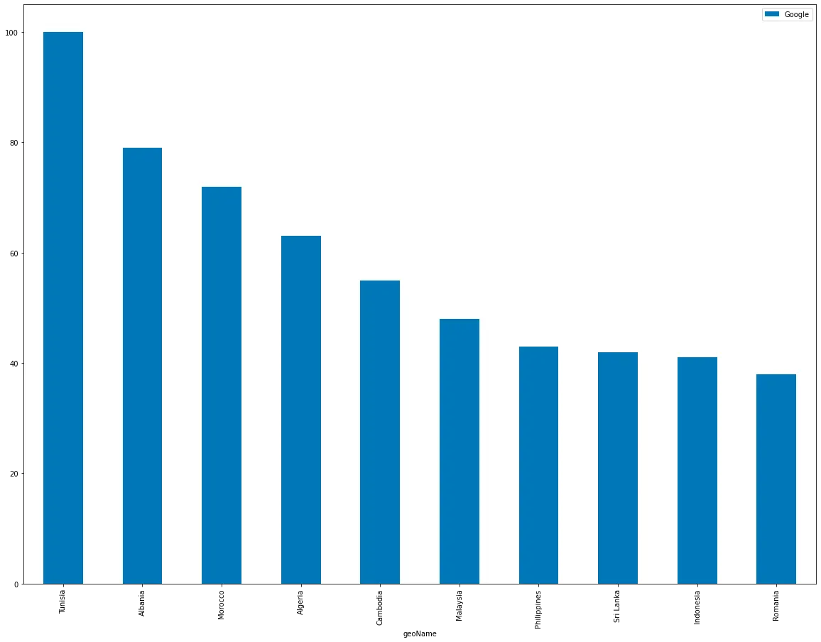
Don’t you get excited to know how many fools searching “Google” on google?
구글에서 “Google”을 검색하는 바보들이 얼마나 많은지 궁금하지 않으세요?
Keyword: Google
Tunisia 100
Albania 84
Morocco 72
Algeria 68
Cambodia 57
Malaysia 51
Sri Lanka 43
Philippines 43
Indonesia 40
Romania 37
Plain Text
복사
Keyword: 모두의 연구소
South Korea 100
Afghanistan 0
Paraguay 0
Nigeria 0
Niue 0
Norfolk Island 0
North Korea 0
North Macedonia 0
Northern Mariana Islands 0
Norway 0
Plain Text
복사
Keyword: 42
Bulgaria 100
France 80
Kazakhstan 76
Ireland 67
Russia 66
Denmark 62
Vietnam 62
Belarus 60
Poland 59
Pakistan 56
Plain Text
복사
I want GRAPHHHHHHHHH
Let’s visualize the result!
시각화시켜보죠!
Likewise, the code and graph.
마찬가지로, 코드와 그래프입니다.
data.reset_index().plot(
x="geoName",
y=keyword,
figsize=(20,15),
kind="bar")
plt.style.use('fivethirtyeight')
plt.show()
Python
복사
You can visualize along different axes.
다양한 축을 기준으로 시각화할 수 있습니다.
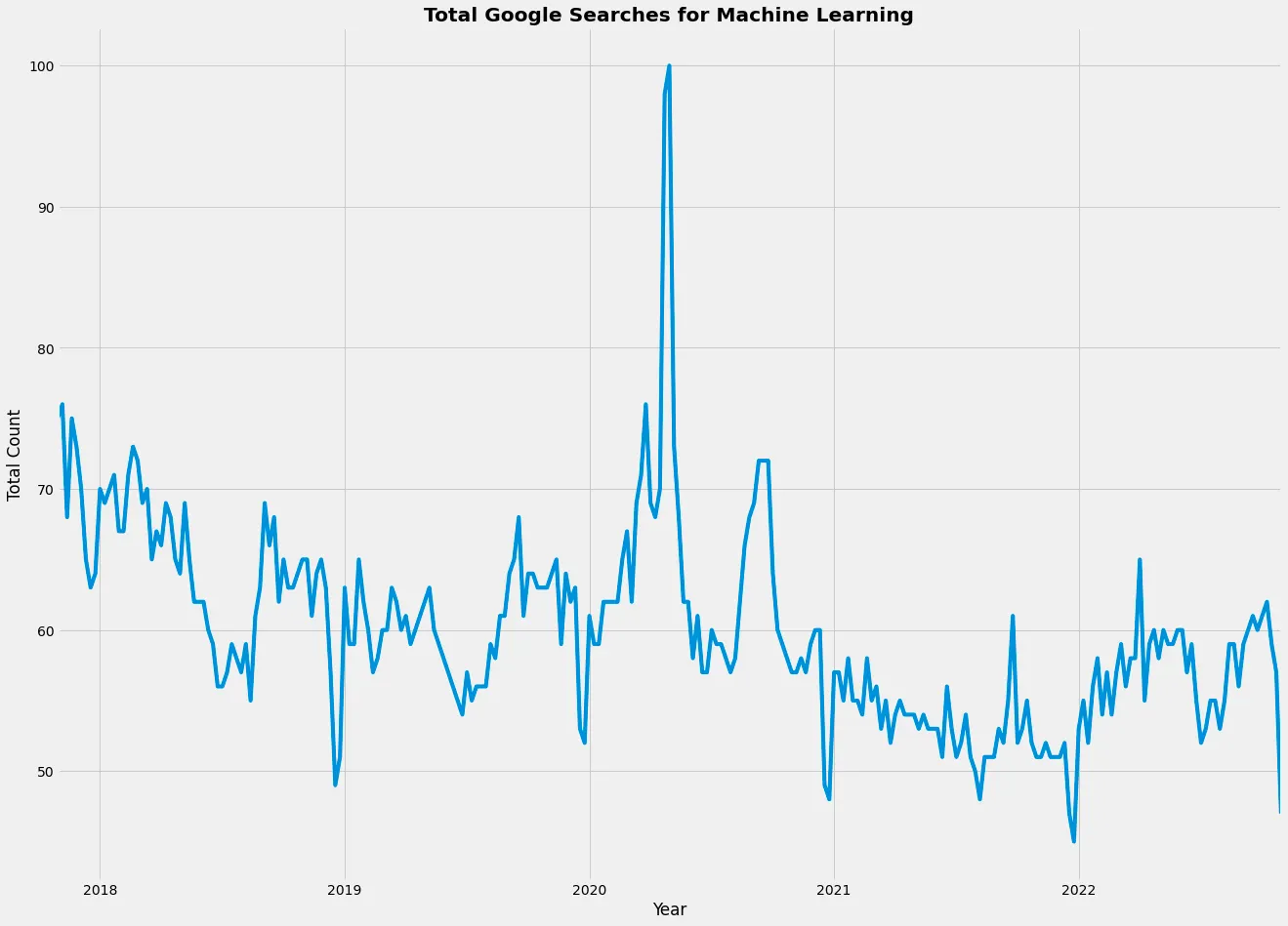
This time, let's check whether the search results increase or decrease through the period.
이번에는 기간을 통해 검색 결과가 늘어나는지, 줄어드는지 확인해봅시다.
data = TrendReq(hl='en-US', tz=360)
data.build_payload(kw_list=[keyword])
data = data.interest_over_time()
fig, ax = plt.subplots(figsize=(20, 15))
data[keyword].plot()
plt.style.use('fivethirtyeight')
plt.title('Total Google Searches for Machine Learning', fontweight='bold')
plt.xlabel('Year')
plt.ylabel('Total Count')
plt.show()
Python
복사